
11 | 14
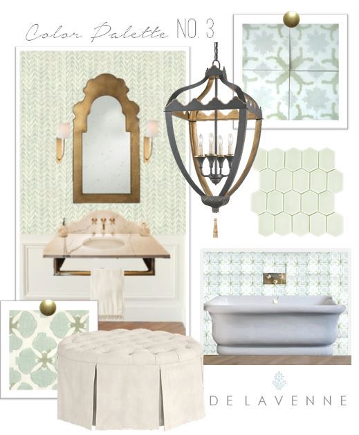
Color Story No. 3
Sorry I am a bit late posting this one, but I hope it is worth the wait! Personally, if I were building a new house for myself, this would be my mine! Eek I would LOVE to have this! Fresh greens, greys, whites and golds...helllllooooo.
In this color story I fused two inspirations into one, because they coordinated so well. A fabric by Galbraith and Paul and a cement tile by Cuban Tropical Tile Co. I know some designers "poo poo" matchy matchy, in fact mismatching patterns is all the rage with some designer aesthetics, but honestly, I have always loved a well coordinated room and always will (I guess I refuse to conform-ha).
This one is very lady-like, but approachable. Cheerful patterns broken up by milky wainscoting, crowned with a killer pendant and a strong statement mirror. I came across this tile while researching cement tiles, which gives us our worldly, european but still has a friendly feel, formalize by the warm gold and marble. Lines are somewhat curved, but transitional (not too curly or ornate). I'd anchor the room with wood-look tile laid in a herringbone pattern.
I've always wanted a bath with a HUUUUGE tufted round ottoman. It lends seating to the room without sacrificing openness, it's easy to walk around, and well, a girl needs a place to put on her lotion without arms other than her own getting in the way, right? Storage you ask? What wouldn't fit on this page is the enormous painted grey armoire adorned with tassels full of linens and every 2 oz. product made by La Mer (that miracle broth is the bomb). A girl can dream, right? I trust you can imagine it too. Sigh.
Enjoy! If you want this room for your own, contact me here.


